
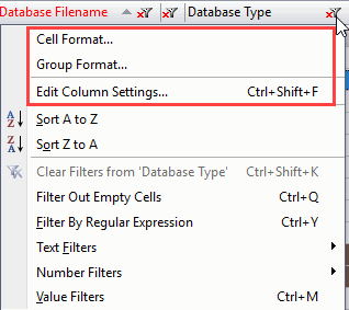
Column Formatting Actions
Within a flexYgrid panel, you can customize various display and calculation preferences on a per column basis.
The preferences available to set will vary per the type of column that you are working with. Regardless of column type, these preferences can always be accessed through the column's header, or the Grid Manager.
The following example illustrates the difference between cells and groups in the same grid.
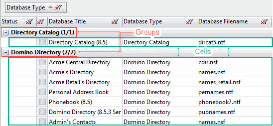
Cell and Group Format
Cell formatting options change the way values are displayed in the cells and, in the case of text display, the headers of columns in a grid panel.
Group format options change the way that values are displayed in group header rows.
Preferences will differ depending on the type of column you are working on. However, the families of options available are the same across Cell and Group options.
|
NOTE |
Some columns, such as those in the 'Edit Column Settings...' dialog grid, will have multiple cell types within the same column. In these cases, all relevant format preferences will be available from it's column header. |
|---|
The following is a list of the different column types and their corresponding formatting options available:
Text columns offer the 'Display' family of preferences, letting you set the color and alignment of the text within the column.
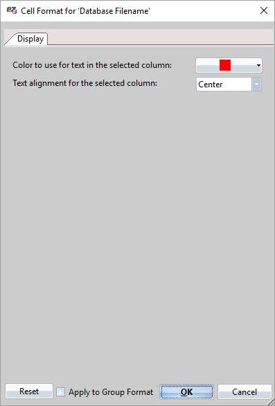
For more information see the 'Display' format preferences page.
|
TIP |
When setting Cell or Group format preferences, checking the checkbox |
|---|

Date columns offer both 'Display' and 'Date' preferences, letting you set the color and alignment of the text within the column, as well as a full range of Date display options.
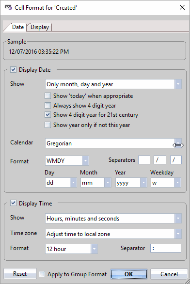
For more information see the 'Date' format preferences page.
Number columns offer both 'Display' and 'Number' preferences, letting you set the color and alignment of the text within the column, as well as a full range of Number display options.
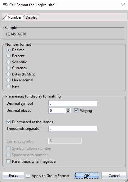
For more information see the 'Number' format preferences page.
Checkbox columns offer both 'Checkbox' and 'Display' preferences, letting you set the color and alignment of the text within the column, as well as the Group/Sort mechanics used on the column's checkboxes.
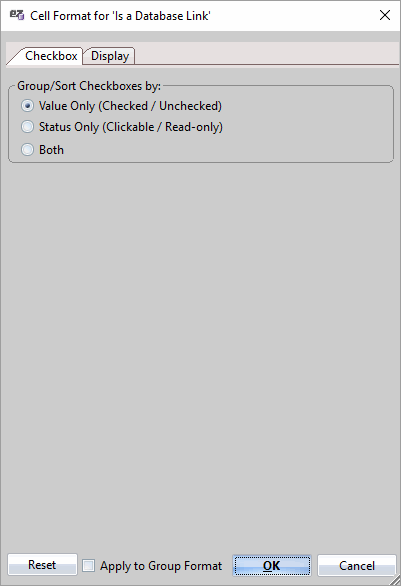
For more information see the 'Checkbox' format preferences page.
Column Settings
Accessed by selecting the column header option 'Edit Column Settings…', the Column Settings dialog gives you an aggregate view of the Column Information for the given column as well as an aggregate selection of editable properties also found in the Grid Manager.
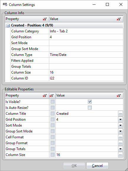
For more information about these specific properties, see the Grid Manager page.