
You can oversee the grid layout and data display preferences through a grid-specific console called the Grid Manager.
Show/hide the Grid Manager by clicking the corresponding toolbar button.

It can also be toggled using the grid side bar button, or by using Ctrl + J.
Once visible, you can resize the Grid Manager by dragging the window border between the Grid Manager and the grid itself.
|
TIP |
You can also detach Grid Manager into a separate window by clicking the |
|---|

Using the Grid Manager
Scroll down or click each section below for more details:
Grid Manager Toolbar and Context Menu Options
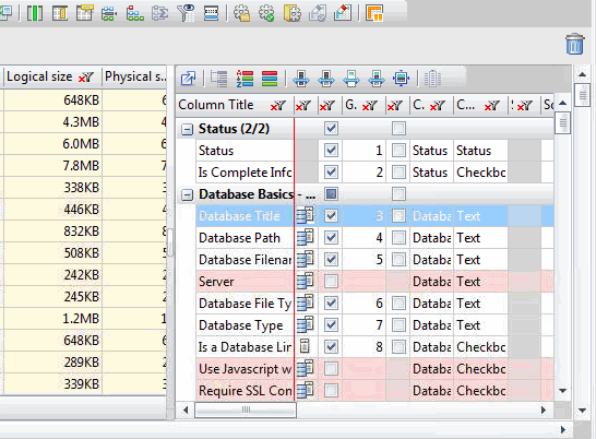
The Grid Manager Toolbar

The toolbar options function as follows:
|
|
Detach Grid Manager window |
Sets the Grid Manager as a floating window. |
|
|
Dock Grid Manager window |
Locks the Grid Manager to its flexYgrid. |
|
|
Categorized Column Configuration |
Selected default mode. Column names are categorized by family. |
|
|
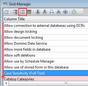
Sorted Column Configuration |
Mode in which columns can be sorted manually in a flat layout. |
|
|
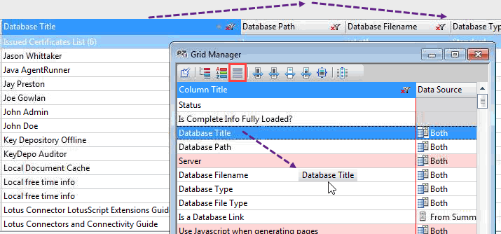
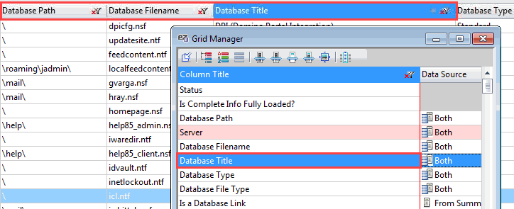
Live Column Configuration |
Mode in which columns can be moved manually. |
|
|
Resize selected columns according to visible data |
Resizes the column on the visible grid data as it is displayed.
|
|
|
Resize selected columns based on full data set |
Resizes only on the full grid data set. This does not include the column header.
|
|
|
Resize selected columns according to header |
Resizes only on the column header. This does not include the full grid data set.
|
|
|
Resize according to header and full data set |
Resizes on the column header and on the full grid data set.
|
|
|
Resize selected columns to default |
Resizes using the Ytria default sizing. |
|
|
Select Column In Grid (Ctrl + Enter or double click with the mouse) |
Moves to the selected column in the grid. |


The Grid Manager context menu
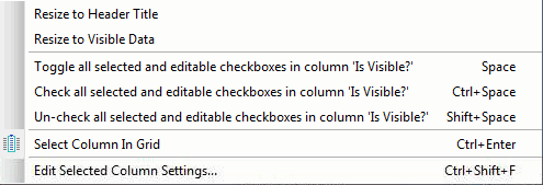
This menu contains a slightly different option selection as the toolbar:
|
NOTE |
If you activate this option with more than one Grid Manager entry selected, all selected columns will be active in the 'Column Settings' dialog. The different columns and their current settings will be shown in a grid for easier management. |
|---|
flexYgrid Column Display
The Grid Manager has three inner flexYgrid column display modes available:

Step 1:
Step 2:
|
TIP |
Editing columns (shortcuts):
|
|---|
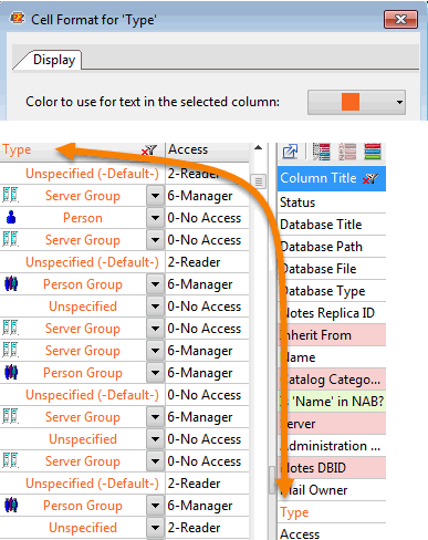
Column Type/Status Indicators
The type of column, as well as the visibility status, is indicated through color coding:
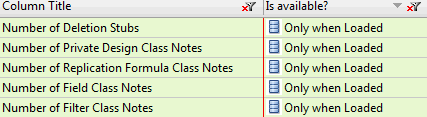
These are columns whose values will only appear if you use specific types of commands. Examples of dynamic columns are Annotation Columns and the Note Counter columns in databaseEZ.
|
NOTE |
You can also apply Cell Formatting preferences and column filters to columns via the Grid Manager.
|
|---|
Grid Manager Columns
The columns in the Grid Manager function as follows:
|
Column Title |
Displays all possible columns (visible and hidden) by name for the associated flexYgrid.
|
|
Data Source |
Only available in the databaseEZ Main Grid.
|
|
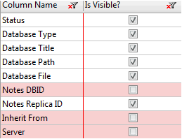
Is Visible? |
If checked, the column is visible in the grid. If unchecked, the column is hidden in the grid.
Categorized Column Configuration mode it is possible to make visible all columns for an entire category simply by checking this box for the category name. |
|
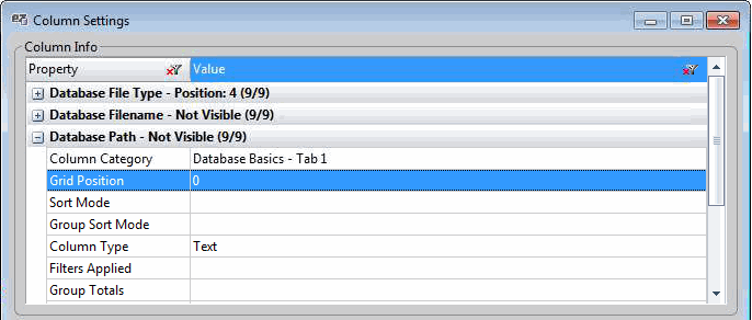
Grid Position |
Indicates the column's position within the flexYgrid. Count starts at 1. Columns with the column 'Is Visible?' unchecked are not part of the count. |
|
Is Auto Resize? |
If checked, resizes the flexYgrid column to its best fit.
Dashboad in consoleEZ).
|
|
Column Category |
Indicates the Column Category name of the flexYgrid column.
Categorized Column Configuration. |
|
Column Type |
Displays the type of data found in the flexYgrid column. |
|
Sort Rank |
Visible when a sort is applied to a column.
|
|
Sort Mode |
Displays and sets the sort to apply to the column within the flexYgrid: Ascending or Descending. Is blank if no sort is to be applied. |
|
Group Level |
Visible when a sort is applied to a grouped column.
|
|
Group Sort Mode |
Displays and sets the sort to apply to the flexYgrid grouped column : Ascending or Descending.
|
|
Filters Applied |
Displays the filter currently applied to the column. |
|
Cell Format |
Sets the flexYgrid column Cell Format.
|
|
Group Format |
Sets the flexYgrid column Group Format.
|
|
Group Totals |
Defines the calculation method of grouped column content : Sum, Average, Minimum, Maximum, Count, Count but Exclude Empty Cells.
Sort all groupings by summary command will use this feature.
page. |
|
Column Size |
Enter the number of characters to be displayed within the column. |
|
Column ID |
Indicates the column's identification which is set upon initialization of the grid.
Automation. |