
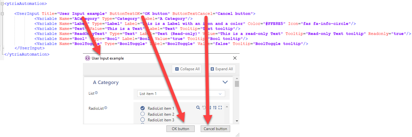
Add a complex input dialog box to the automation script.
UserInput interrupts automation with a dialog pop-up where the input fields are constructed using the Variable sub-actions.
Upon clicking Cancel, automation stops.
Upon clicking OK, one SetVar action is generated for each Variable sub-action and the automation resumes.
SetVar names are set using the Name attribute value of each Variable sub-action. The values depend on the corresponding input fields in the dialog.
Tag Attributes
|
Attributes |
Value Description |
|---|---|
|
Title |
Dialog title |
|
ButtonTextOK |
Text to set on OK button. Defaults to 'OK'. |
|
ButtonTextCancel |
Text to set on Cancel button. Defaults to 'Cancel'. |
|
IgnoreInPreset |
If set to TRUE, this instance of UserInput shall be ignored during job preset creation . Defaults to FALSE. |
Variable sub-actions
Each <Variable> sub-action adds a field to the dialog.
Variable Tag attributes
|
Attributes |
Attribute Values |
Value Description |
|---|---|---|
|
Name |
N/A |
|
|
Value |
N/A |
Default value to put in dialog input field. |
|
Type |
See Value Description |
The Type value is controls the type of field that will be displayed. All variables end up as text in the script One of:
Defaults to Text- Not Required
|
|
Label |
N/A |
Text to display in front of the input field or for Category title. |
|
Tooltip |
N/A |
Generates a tooltip widget in the dialog, next to the label. |
|
ReadOnly |
True/False |
To prevent a field from being edited. Defaults to False. |
|
Mandatory |
True/False |
To make editing of a field mandatory. Defaults to False |
|
Expand |
True/False |
For Category type only - If set to False, the category appears collapsed and the user must click it to see the input fields. Defaults to True. |
|
ListName |
N/A |
For CheckList and MultiList types only Name of the list created from the checked (resp. selected) items. |
|
Color |
Any HTML color code |
For Label type only - Hexadecimal RGB with a leading # (eg. #FFE8E5). |
|
Icon |
N/A |
For Label type only - Font Awesome icon name. |
|
Max |
Any integer |
For Integer type only - Maximum value allowed. Defaults to INT_MAX (2147483647). |
|
Min |
Any integer |
For Integer type only - Minimum value allowed. Defaults to INT_MIN (-2147483648). |
|
HasSelectAll |
True/False |
For CheckList type only - If set to True, a button is shown and allow to select all items at once. Defaults to False. |
|
FileExt |
N/A |
For InputFilePath and OutputFilePath types only Allows to specify the file extension(s) (separated by semicolon, if multiple), * is used to have the 'All Files choice'. Defaults to "*" |
|
ObjectTypes (sapio365 only) |
N/A |
For these types only:
Allow to specify the object type(s) (separated by semicolon, if multiple) to set in the dedicated filter (expected values as displayed in dialog). |
|
waitinfo |
N/A |
used by <variable type=”RunScript”>; This will be the text shown under the spinning wheel shown as soon as the user clicked on the button, and will stay over everything until the callback is called. |